Portfolio
While viewing this brief portfolio of design work by Norman Adams, it should become apparent that Norman can provide all that is necessary for a project with graphics that perform to success. With the experience and knowledge he brings to each job, Norman can provide answers to questions that you may not have even considered. Whether it is for print or web, the graphics needed to get your message out there is what Norman offers.
Working closely with client and vendors, Norman offers solutions for any project that needs to be communicated. Be assured that Norman is capable of providing a broad range of services to communicate the "neccesaries". He can provide assistance by coordinating your project from beginning to end. Norman can initiate the creative direction or art direction, supervise print production, and just about anything in between. Norman can be involved in many different aspects of a project or simply one segment of a project.
This portfolio shows the versatility Norman brings to any communication. The graphic design, the art direction, the project process from begining to end is what Norman has been involved with throughout his three decades of career experience. Working as Art Director, Creative Director, Production Artist, Writer, Illustrator, Re-Toucher, Camera Man...well the list goes on and so goes the portfolio. Enjoy.
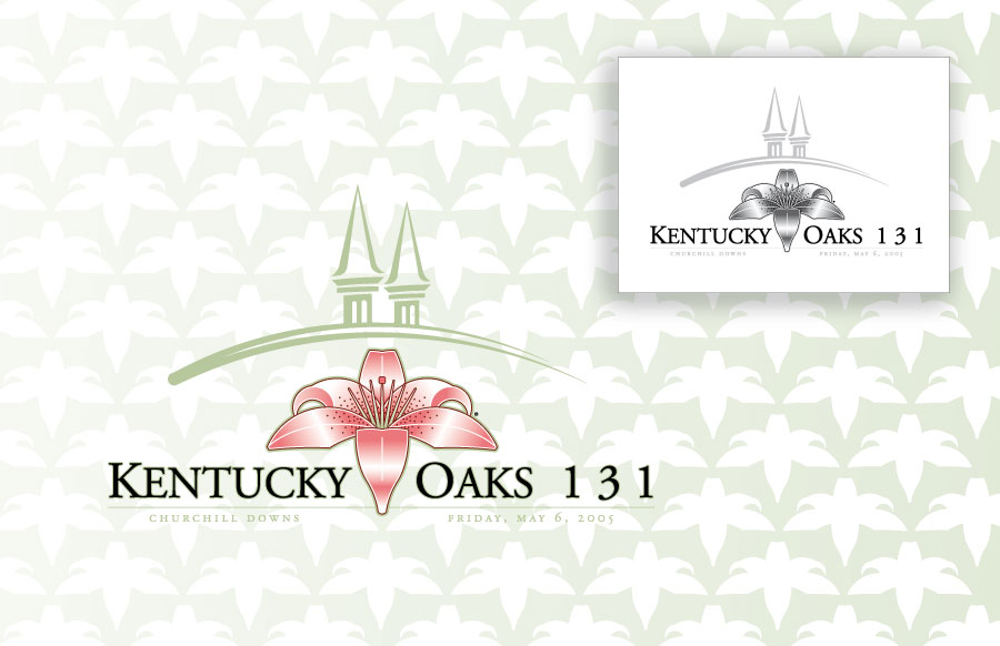
Kentucky Oaks Image
While at Churchill Downs Incorporated it was Norman's distinct honor to create the first Kentucky Oaks logo to be used on the Julep-like glass that has become a tradition at the track. The winning filly of the much heralded race is graced with a garland of lilies so the logo quite naturally begged for an image of a lily to celebrate the race. The logo was created in full colour and in greyscale for approriate usage. The use of the stylized twin spires, signifying the symbol of Churchill Downs, was borrowed from the Kentucky Derby 131 logo which Norman created.
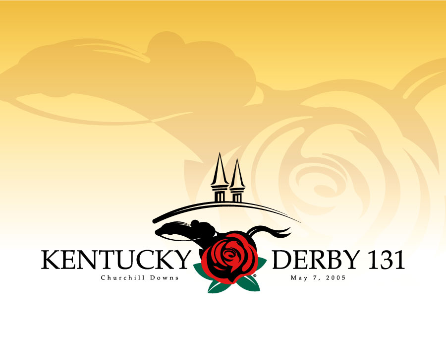
Kentucky Derby Image
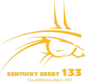
The Kentucky Derby 131 logo was said to be the best he had ever seen by then CEO Tom Meeker. In the tradition of creating a logo for the fastest two minutes in sports, it was necessary to incorporate a racing horse and jockey, a rose for which the race is the run, and the twin spires that symbolize the legendary Churchill Downs race track. In this approach, Norman is proud to say that all the elements have been included and in an elegant and exciting fashion.
While making the logo for the event, it was imperative that the image be transferable to all sorts of merchandise. This simple approach used only three colours, black, red, and green.
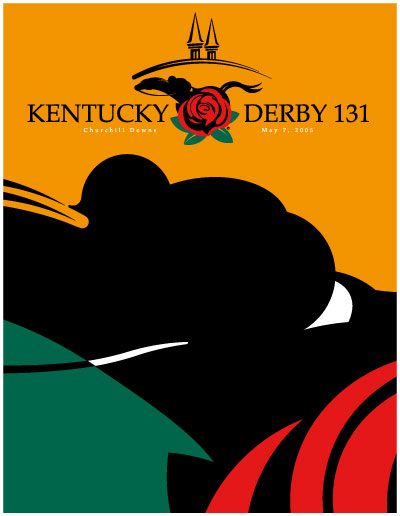
POP Point Of Purchase Poster
This Point Of Purchace poster utilizes the logos’ graceful lines of jockey and horse and rose to create a super graphic.
This poster image is designed to be displayed near merchandise to assist in authenticating the brand of Kentucky Derby 131.
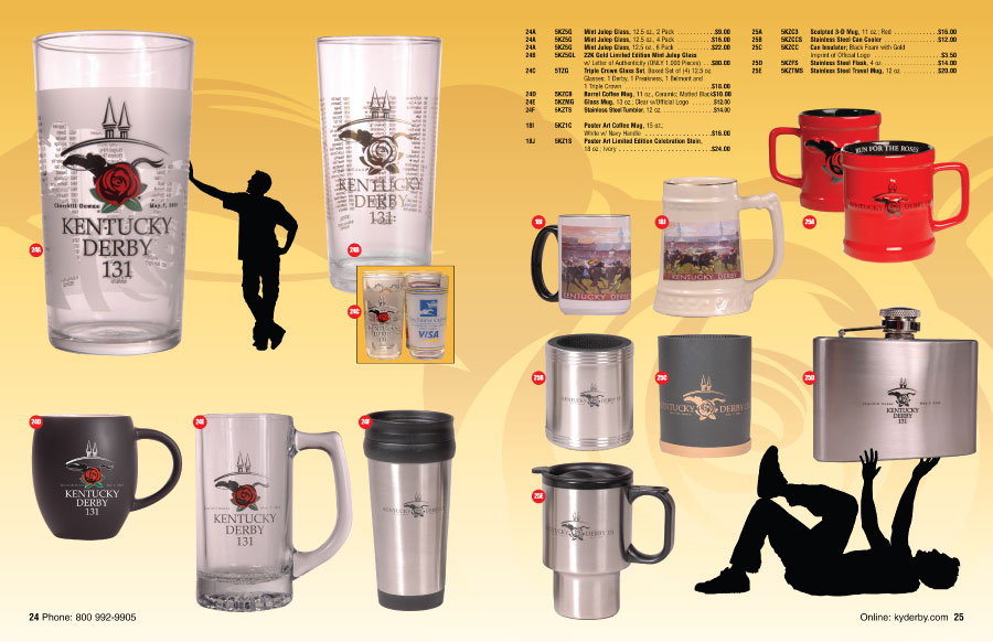
Catalog Design
Designing the catalog for any merchandise is always fun. Here is a spread from the Kentucky Derby 131 merchandise catalog. The idea of the Kentucky Derby 131 logo's silhouetted jockey and horse have been replicated in the catalog by showing the shopper in silhouette. In these pages, the glassware is highlighted and the involvement of the shopper is playfully involved with the items available. As designer, Norman thinks these decisions are important in making a finished product do what it should do. Coordinating merchandise and photoshoots to make sure all items are shown is a good way to keep a designer on his toes. In this catalog, the theme of the logo is followed through to make merchandise not only enticing but also coordinated and orderly (no pun intended).
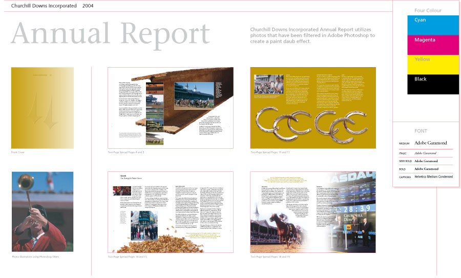
CDI Annual Report
The Churchill Downs Incorporated annual report is printed every year to inform its shareholders how the company has faired. Just as any project goes, the information comes from many individuals and the creative direction is worked out, presented, and agreed on in committee. With his strong comprehension of how to relay information in a precise and pleasing manner, Norman is comfortable leading a team to oversee the finished product to a logical conclusion.
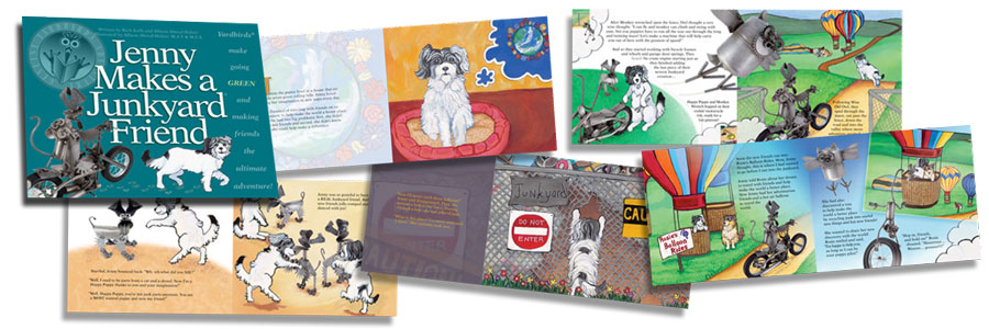
Genuine Yardbirds Adventure
Yardbirds are known throughout the United States as those clever animals created from old metal parts and discarded yard tools. When their creator, Rich Kolb created a children's book with illustrator Allison Aboud Holzer, Norman signed on as the Art Director.
One of Norman's top priorities was to make sure that all who saw the book knew it was a Yardbirds original. The Genuine Yardbirds Adventure series begins with Jenny Makes a Junkyard Friend. The tale of Jenny and the Yardbirds is one of helping the earth go green through recycling with quite an adventure involving
a number of characters from the extensive Yardbirds collection and Jenny, the puppy.
Norman put it all together for the Yardbirds, working in a team effort with the writers, illustrator, Photographer, and printer. Perhaps you should speak to Norman about the project you've been brewing and let Norman help you guide your project to success.
Some page spreads from Jenny Makes a Junkyard Friend
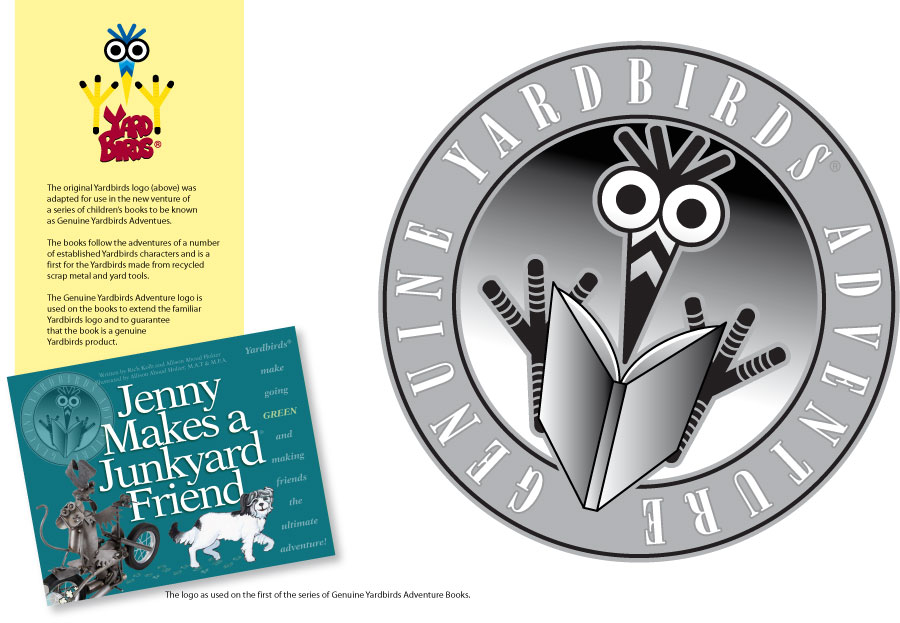
Genuine Yardbirds Adventure logo
The logo created for the Genuine Yardbirds Adventure had to assure that everyone knew the book was an original Yardbirds creation and had the simple task of stating the book is the genuine article. Norman was fortunate enough to work with Rich and Allison in
designing and art directing the book that became the first in the series of Genuine Yardbirds Adventures, "Jenny Makes A Junkyard Friend".
Though the Genuine Yardbirds Adventure logo doesn't stray too far from the original Yardbirds logo, it has a definite presence of it's own without breaking from an established brand look and thusly retains the brand look. Norman is well aware of brand importance and can work within a brand's restrictions and even create the boundries within which a brands's imagery lives.
Yardbirds. The Book!
Print Advertising
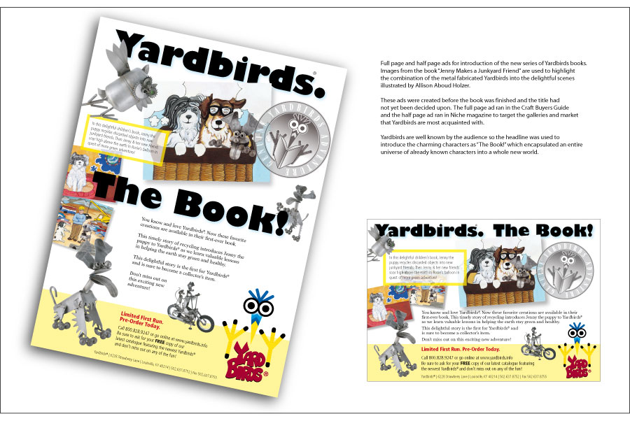
To spur pre-sales of the book "Jenny makes a Junkyard Friend", a couple of ads were run to introduce the Yardbirds venture into book form. These ads were designed and written by Norman and created in InDesign to print in the magazines using each publications specifications. The use of images from the book designed by Norman are a nice complement to show what the book is all about. The book is a delightful story of Jenny the puppy who in her journey to discover the world finds that making friends the likes of Yardbirds is a fine way of helping the earth recycle. The depiction of the book and the Yardbirds characters allows the audience to see what the book is about before it was printed.
Road To The Roses Derby Fantasy Challenge
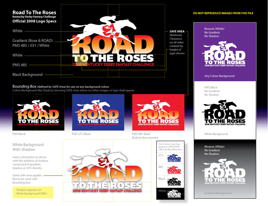
When the Kentucky Derby Fantasy Challenge needed an image to use for their print and web graphics, Norman set his skills to work creating the image that would be the Road To The Roses logo. Here is the logo showing different aspects of it's usage. This graphic was sent to those who implemented the logo in it's many manifestations both in print and electronically. The information is precise and thorough and fits on an eight and a half by eleven inch piece of paper, as well as a screen sized PDF which was sent via the internet.
Churchill Downs Brew and Bar-B-Q Festival
Each year, in the infield at Churchill Downs, smoke from the grills of the best Bar-B-Q makers in the region fills the air as the race fans crowd in to devour the feast. The event demands a look which speaks not only to the food but to the festivities such as the music provided for the revelers. The logo consists of a flaming banjo created from the grill and is festooned with the banner calling out the Festival.
![]()
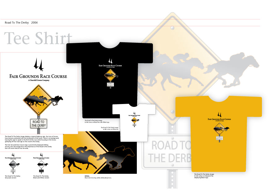
Road to the Derby Graphic
The beginnings of the Kentucky Derby start way before the first Saturday in May. Fairgrounds Race Course, which is a property of CDI and located in New Orleans, Louisiana, hosts the race that starts the road to the Derby. To commemorate the event and to generate some interest in the races, the Road to the Derby image was created by Norman to be used on Tee Shirts and in print and web applications.
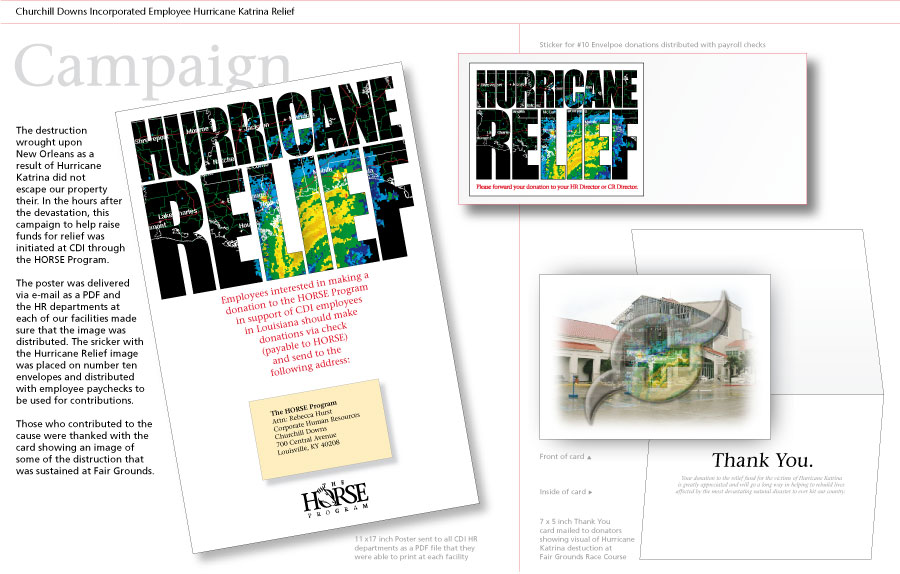
Hurricane Relief for Fellow Workers
When Fairgrounds Race Course in New Orleans, Louisiana was hit by hurricane Katrina, many of the CDI employees were affected not only at the track but by much devastation around the city. A call for help was sent throughout the CDI corporate owned properties with these items designed by Norman. This effort was responsible for quickly raising money to help fellow employees and was printed inhouse to keep the expense low.
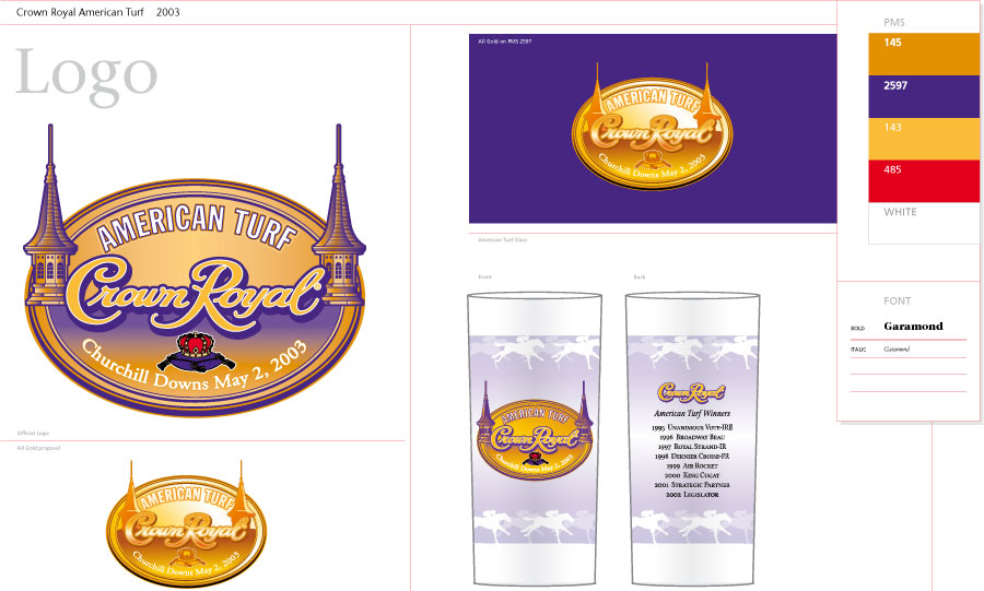
Crown Royal American Turf Race
Supervising the design and production of the Crown Royal logo and glass for their American Turf race demanded that the Crown Royal image be melded with the Churchill Downs image. This layout shows the logo and glass designs that were produced for the Crown Royal American Turf Race in 2003.
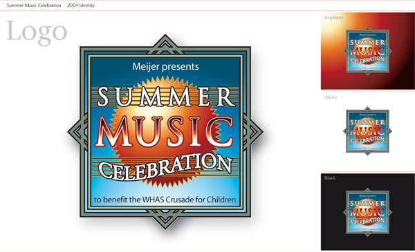
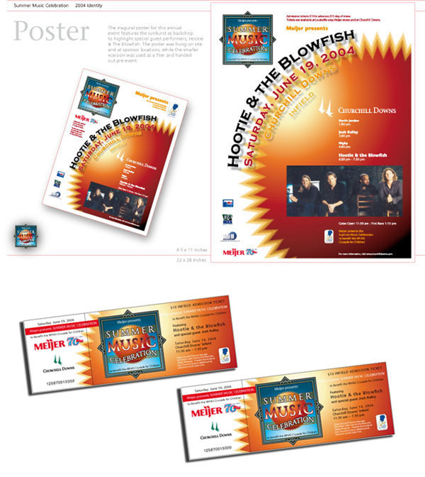
Meijer presents Summer Music Celebration Poster and Ticket
Meijer presents Summer Music Celebration is an event that takes place in the infield of Churchill Downs every year.
The logo for the celebration is diplayed here showing some different background treatments. For the image Norman relies on a graphic interpretation
of the summer’s sun to undulate the beat of the music. The five line staff is the perfect visual device to display the message of “Summer”
and “Celebration”. In it’s music note construct laid upon the staff, we are offered to make note of the Celebration.
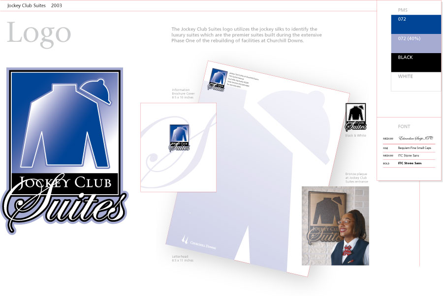
Jockey Club Suites at Churchill Downs
Norman designed the Jockey Club Suites logo for the new Jockey Club at Churchill Downs based on the image that race
fans have come to know as the jockey silks and cap which tell where the horse is stabled. The generic look of the silks is
partnered with the elegant script which eludes to the historic ledgend of the track.
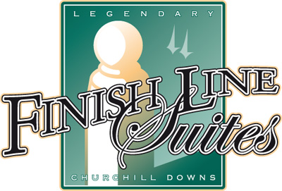
Finish Line Suites at Churchill Downs
Norman designed the Finish Line Suites logo for Churchill Downs
in homage to the track’s history. The finish pole is where it all happens. The winner of the Kentucky Derby must cross it first to win.
The suites are positioned above the finish line for that perfect Derby day seat.
Depicted here, the pole takes on the glow of a Derby win while the same elegant script used for the “Suites” in the Jockey Club Suites logo
harkens back to the legendary tracks’ beginnings.
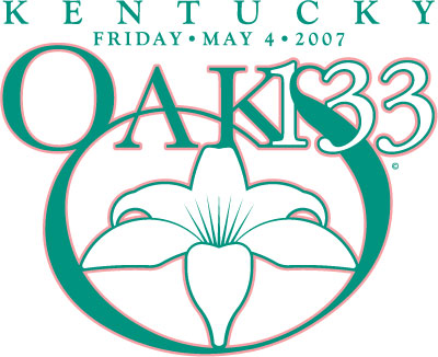
Kentucky Oaks 133
Norman's ability to create typography is exquisitely displayed in this rendering of the one-hundred-thirty-third edition of the Kentucky Oaks logo. The image was designed to be used in print and web as well as a number of pieces of Official Kentucky Oaks merchandise such as tee shirts, coffee mugs, and many other items. The logo exagerates the swoop of the "S" in the word "Oaks" to create a nice spot for nesting the lily which symbolizes the rich tradition of the Fillies run for the Lilies. The simple two-colour approach was designed to be able to replicate easily for all of it's applications.
Brand Standard for Kentucky Derby 133
Norman designed the image for the Kentucky Derby 133. The implementation of the logo demanded a standard which all who manufactured the image had to follow.
When you Open Kentucky Derby 133 Brand Standard below you will see all the allowable aspects of the logo, whether it is to be used in print or web or stitched onto a visor cap. This same PDF was sent to all vendors who were responsible for replicating the image and, as you will experience, the file is navigable through clicking on the section that refers to the area a viewer would like to learn about.
Norman designed the logo to be flexible in it's use and likewise the presentation of information about the usage of the logo is designed to be flexible in it's use. Rather than navigating through the information in a lineal manner only Norman made the decision to make available the navagible PDF document. The standard for each specific look is explained verbally and in graphic form to assure users' compliance with the brand. Norman's understanding of graphic principles allows the dialog of imagery to be stated simply and instructions for replicating a logo are easy to follow by all who are involved in printing or manufacturing or placing the image.Once the downloaded PDF is open, click on the oversized logo that represents the front cover of the Kentucky Derby 133 Brand Standard and you will be able to click on the graphic representing the topic you would like to know more about. Perhaps Norman could do something similar with that project you have sitting on your desk.
Open Kentucky Derby 133 Brand Standard
More to come...
home